
PURACY: Design Strategy
Puracy is a line of plant-powered and eco-conscious household and personal care products with a raving fan-base and science to back its claims of being the cleanest cleaning product out there. Having established a fanbase online, Puracy was looking to move into retail chains like Target. To increase visibility, Puracy approached me to work on their rebrand's design strategy. They had already had the basics of the design set (like logo, fonts and the drop shape as a container for the logo and product name) and I was tasked to crystalize a system that showed four visually distinct looks for the three separate product categories: Home, Baby (+ Pet), and Bath.

I worked with a designer to create a system of icons (used more heavily in the "HOME" category below to counteract the notion that natural products are not as tough on stains) and to lean into the utilitarian aesthetic meant to enhance the tough-on-dirt promise of the product category:

HOME category
Each icon was meant to have a distinct look (to avoid product confusion) but still look cohesive within the category as well as throughout all of Puracy's product lines.

The "BABY" line allowed for a unique pastel color fill within the hero "drop" design and a "nursery-like" background pattern on the label.

BABY category
The "BATH" category saw a pearly/iridescent effect over the hero drop shape, reminiscent of the surface of a bubble, and deeper background shades for contrast:
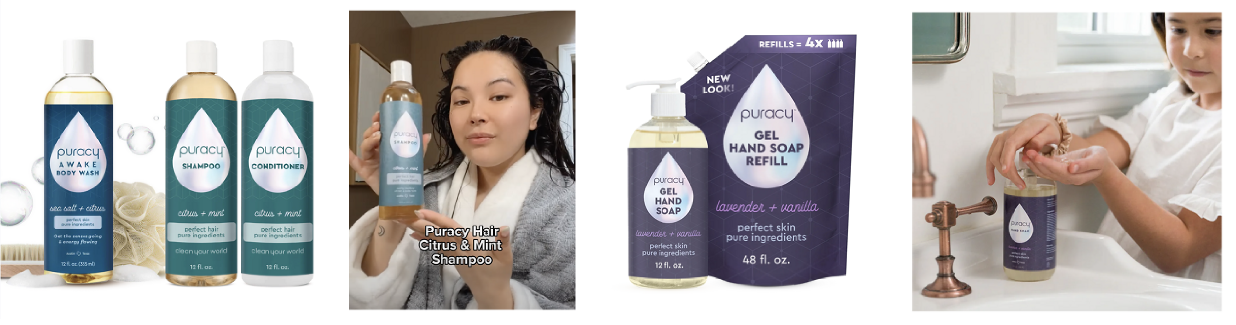

BODY category
Puracy successfully launched their updated product lines at Target throughout 2024 and continues to be a fan favorite for nature-lovers and health nuts throughout the land ✨!

Client: Puracy/Branded
Creative Director, Art: Daria Erkina
Strategy Director: Debra Wolf
Designer: Amanda Menge